Creating a cohesive culture for Savills
Key Features:
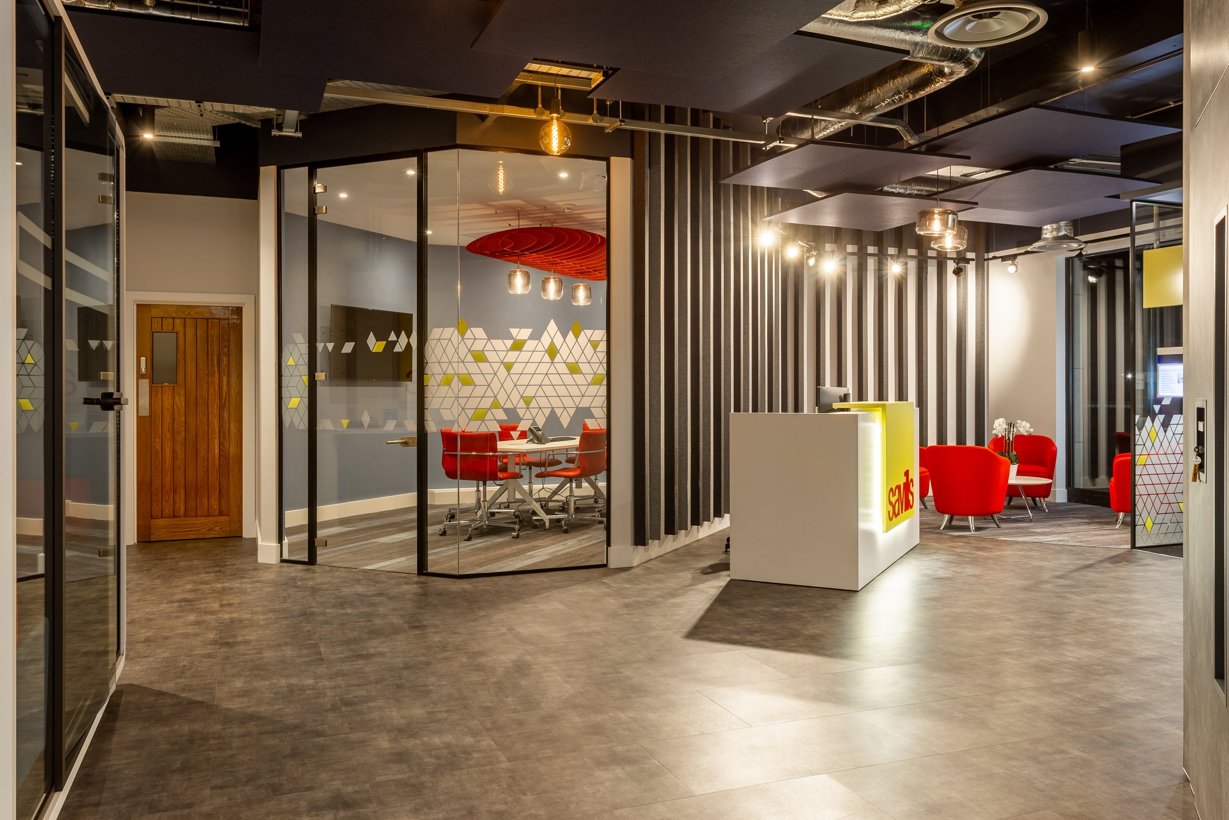
Brand-Centric Reception: Inviting reception area showcasing Savills' bold brand colours, equipped with Autex acoustics for noise reduction.
Inclusive Accessibility: Universal access is ensured through a raised access floor and ramp installation, providing a sleek and streamlined look.
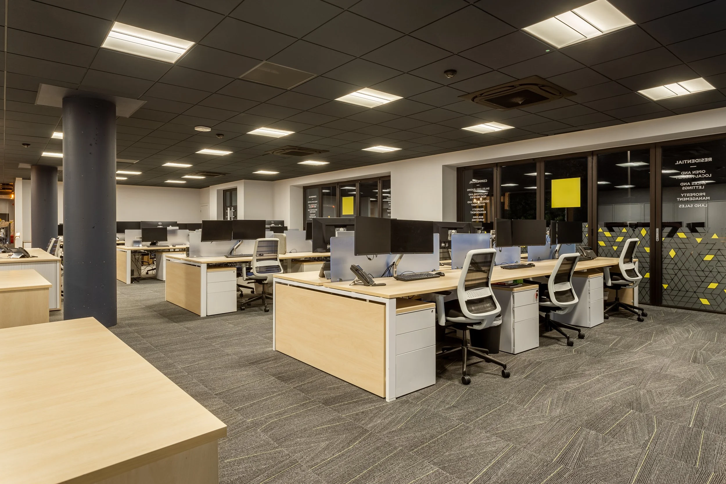
Agile Working Zones: Two distinct zones created for different teams, separated by acoustic screens.
Breakout Zone: Acoustic beams are used to craft a light, open space. A café-style kitchen for fostering relaxed conversations or quiet reflection.
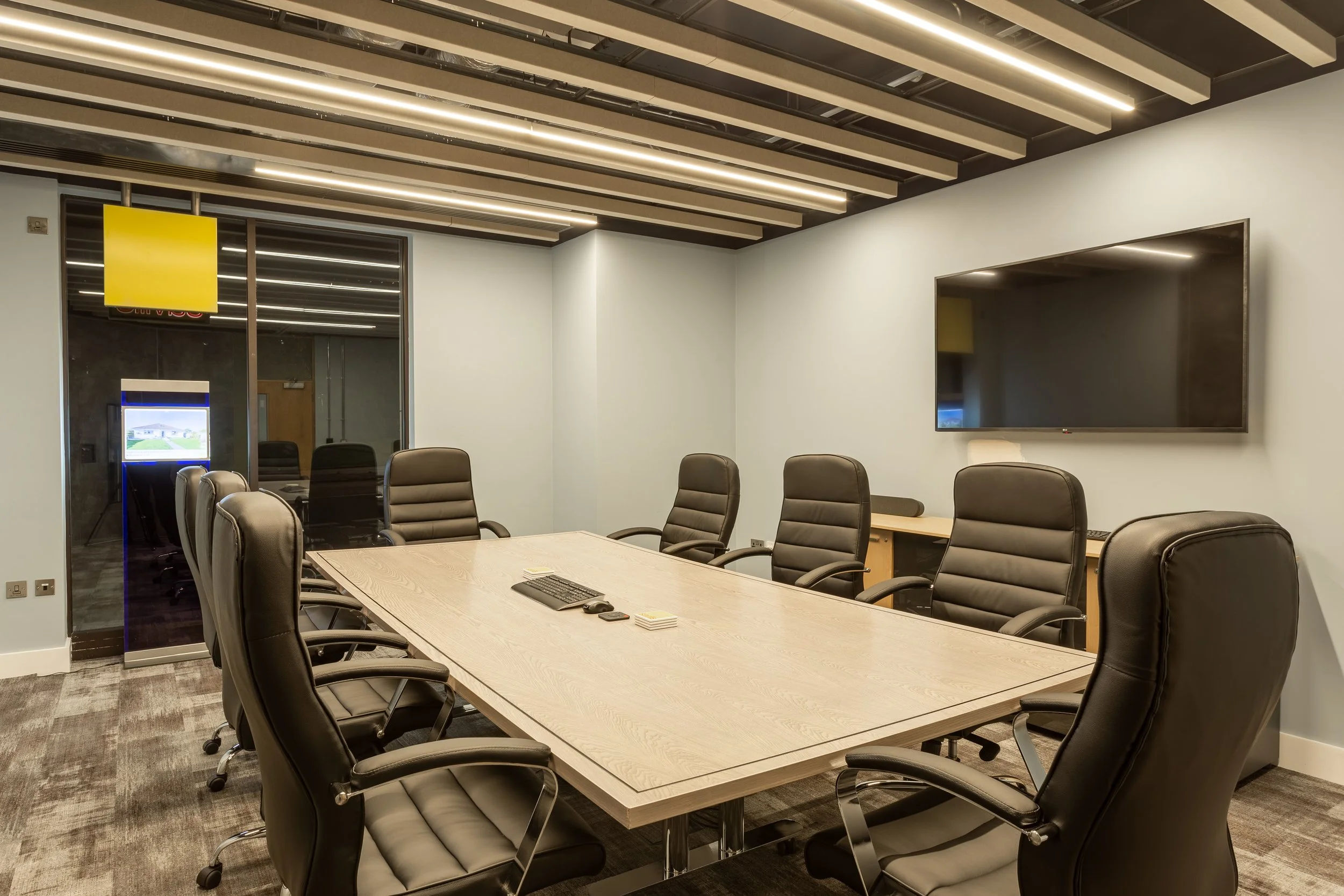
Flexible Boardroom: Equipped with a moveable wall, enabling swift transformation for various needs and events.
Uniting Teams in an Agile Workspace
Savills, a leading global property agency, desired to merge their Residential and Commercial teams, previously working in separate offices, into one cohesive space on Glategny Esplanade.
Embracing new working practices adopted globally, Savills aimed to nurture creativity, passion, and employee well-being in the new office, while considering practicalities like team dynamics and client confidentiality.
Promoting Inclusivity and Efficiency
Savills envisioned an agile, vibrant workspace that would energise their team and offer practical functionality. They believed that endorsing practices like agile working and regular breaks would significantly improve productivity and health, creating an office environment that mirrored Savills' values and culture.
Their focus was to drive productivity and positivity through our '3 Cs' design philosophy: Collaboration, Concentration, and Contemplation.


A Warm and Accessible Welcome
We utilised Savills' bold red and yellow brand colours in the reception area, fostering instant brand affiliation. We installed vertically fixed rafts from Autex Acoustics to diminish noise in this high-traffic area.
To ensure office-wide accessibility and maintain a sleek, streamlined look, we installed a ramp to accommodate the change in level for the open-plan workspace.
Agile Working Zones
We embraced Savills' agile working approach, reducing traditional desk space to allow for more versatile areas. Two work zones were created for the Residential and Commercial teams, separated by acoustic cascades instead of physical walls.
These zones, complemented by Savills-themed acoustic pods, offered staff a place for focused work or confidential conversations.
Breakout Zone for Collaboration
Our design promoted a relaxed environment for collaboration or personal reflection, emphasizing staff well-being. We crafted a breakout zone with acoustic pillars serving as non-physical dividers, preserving openness while managing noise.
The kitchen and café-style seating offered additional space for relaxed conversations or solitude. The boardroom was designed for flexibility, with easily movable furniture and a removable folding wall for diverse uses.
“The new premises presented an opportunity to reimagine the way we work locally, bring the two offices together and put employee engagement and wellbeing at the heart of our workplace.”
Discover the power of exceptional office design.
Let's create a workspace that inspires, nurtures, and elevates your business. Get in touch with our design experts today to discuss your project and experience the POS difference.


